I was paying so much attention to technical side, forgot all about why I liked photography. It’s about Composition. I liked a lot of photographs, never really paid attentio n on why some photographs are more interesting. Having few courses let me understand few things about photography and what makes an interesting image. Though I can find much better images in the web to show these concepts, I don’t want to user others pictures, so here are few samples on what I took and what I learned from them. (Need to find out if it is copyright violation if I use others picture as example and credit them for their work).
Few of the courses learned.
https://www.lynda.com/Lightroom-tutorials/Exploring-Composition-Photography/364444-2.html
1.Keep it Simple
Easier said than done, the idea is just to keep the images to few key elements, There should be no more than 3-4 main elements in the image. I started looking at the popular photographs. All the ones I liked has just one or two main subject, there is no confusion about the subject and very few things are in the way of distraction.
There is one thing common among all the popular ones. Pretty much popular image can be just said in one word.
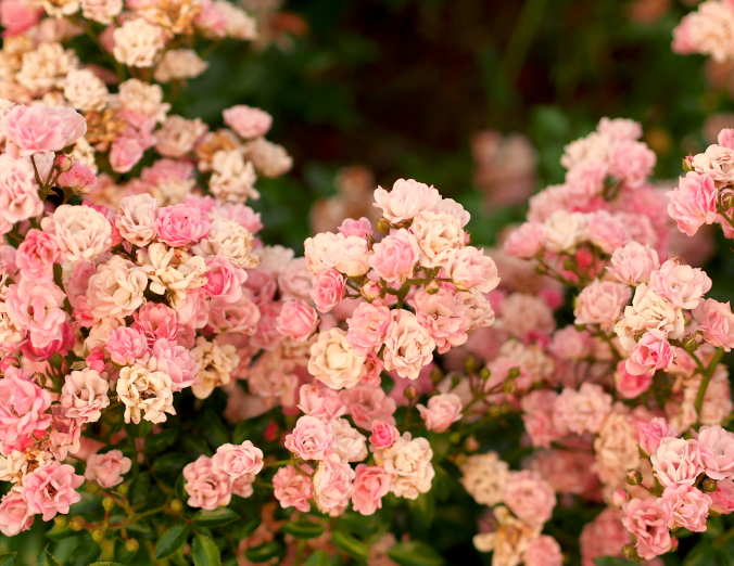


But keeping it simple makes it better
2.Balance , but also have Asymmetry
This was little interesting concept that I never realized, which makes photographs stand out. If the photo graph is divided into two halves, there is need for one side to balance the other side. The balance can be in
- Tone ( If tone is lighter, other side can be little darker)
- Object (A mountain in on side , but little tree on the other side)
- Having a person adds a lot of weight the subject.
You can find so many samples, but here is simple one on tone. Just the inclusion of brighter building to balance the big building on the left.


Having a bright building in the right, balances the big dark tall building
3.Leading Lines
Leading lines are always interesting subject, if it leads to the subject then the image has even better appeal.
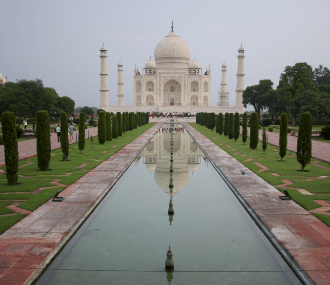
Tajmahal: It’s one of the few places on earth where it’s impossible to take a bad picture, no matter how bad the weather is. It’s bright sunny day with no clouds and you take picutre at noon, still looks good, dark dull cloudy day (like the above picture, no retouching just OOC jpeg), still looks good. Perefect weather in the earling morning sunrise, will look like best picture you have ever taken.

Leading lines need not be just lines
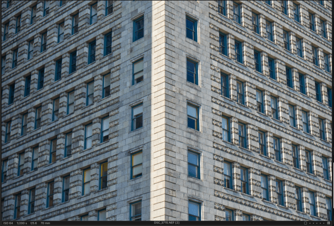
3.1 Make it Diagonal Lines, when possible
Having some diagonal element in the image makes the image more interesting.


Diagonal lines make it more interesting
4.Remove unwanted elements (Look around the frame and subject)
One of the important thing is after framing the picture, take a look around the edges of the frame that will let you if there are any distracting objects in the picture.

Looking around would have elicited the lamp shade

The tree branch could have easily dilated the capture, rather than working on the frame

Removed the book after looking around the subject
5.Tonal (Im)Balance
Darker and lighter area of the image always makes an interesting subject
Technically Correct, but not much interesting.
All the details are in the histogram, with no blown out highlights are shadows

Increasing the tonal contrast, makes the image interesting
Histogram with crushed highlights and shadows
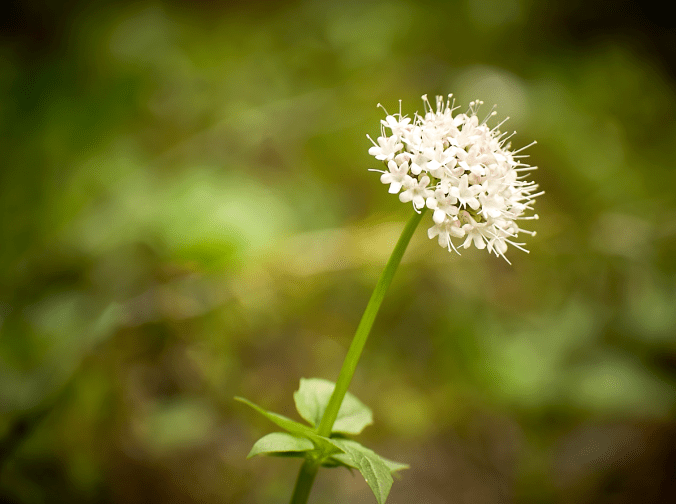
6. Natural framing is always interesting subject
7.Rule of Thirds (Almost every popular photo I have seen )
Few interesting things learned, it’s not about dividing frame into three equal parts and keeping the subject on the dot. It’s about moving the subject to one of the thirds, the recommendation was not use the lines
If a person is looking on the side, keep more area in front of the person.
Above all : Record what was interesting when the picture was taken
Before taking an image take note of what makes that subject interesting. After taking the picture what are the things that I noticed and camera didn’t account for.
For example picture alone doesn’t tell many things, I like to note of things like
- The scene had much brighter tone
- The scene had a yellow cast.
- I didn’t notice anything in the dark area ( No need to recover shadows, just expose for bright object)
- I like the texture of the dark object (forget highlights and expose for darker region)
- Red and Yellow , always make sure why they are included. I like bright red line, or I didn’t notice the stop sign (In pictures it could very distracting, so have note on what was seen, so the tone can be adjusted accordingly).
- I like the geometry play of lines, so all other distracting elements can be cropped out
For example In this case the picture looks so boring, doens’t reflect what I saw. Having taken few notes and later correcting it makes it more interesting.

- As taken in the camera, boring picture doesn’t reflect the interesting pattern and color I saw.

Cropping and adjusting the tone based on what I saw was interesting ( The bright red line and the blue sky, interested by the black and white building)
Conclusion (Practice! Practice! Practice!)
The problem in learning few things about composition and looking at my pictures, I want to re-shoot every image I took. All my photos now feel like something can be improved on it ( Of course I always know many of my pictures can be improved when I look at the same subject in a magazine or popular websites, but the difference now, I know at least few things that needs improvement).
Practice! Practice! Practice! Then all the interesting composition rules becomes something like muscle memory and don’t even think about it. That’s what many photographer mentioned.
